Sunday 15 May 2011

It's time to say Good-bye.....


Conclusion....

 Inspiration
Apple ,Bicycle,cow....Gregoire Ganter 2008

My Interpretation
Hand screen printed Roman Bullion ABC


To conclude my Final Major Project I want to let you know how I came up with the original idea and how I developed it from my own interpretation. The picture at the top of this post is something that I bought for my disabled son Oscar. I loved the colours and the concept of having different designs to emphasis the letters, rather than a boring old A - Z. From there I've decided on the font that I want to use and hand printed a simple set of letters using some screen prints, as a background, that I'd prepared beforehand.

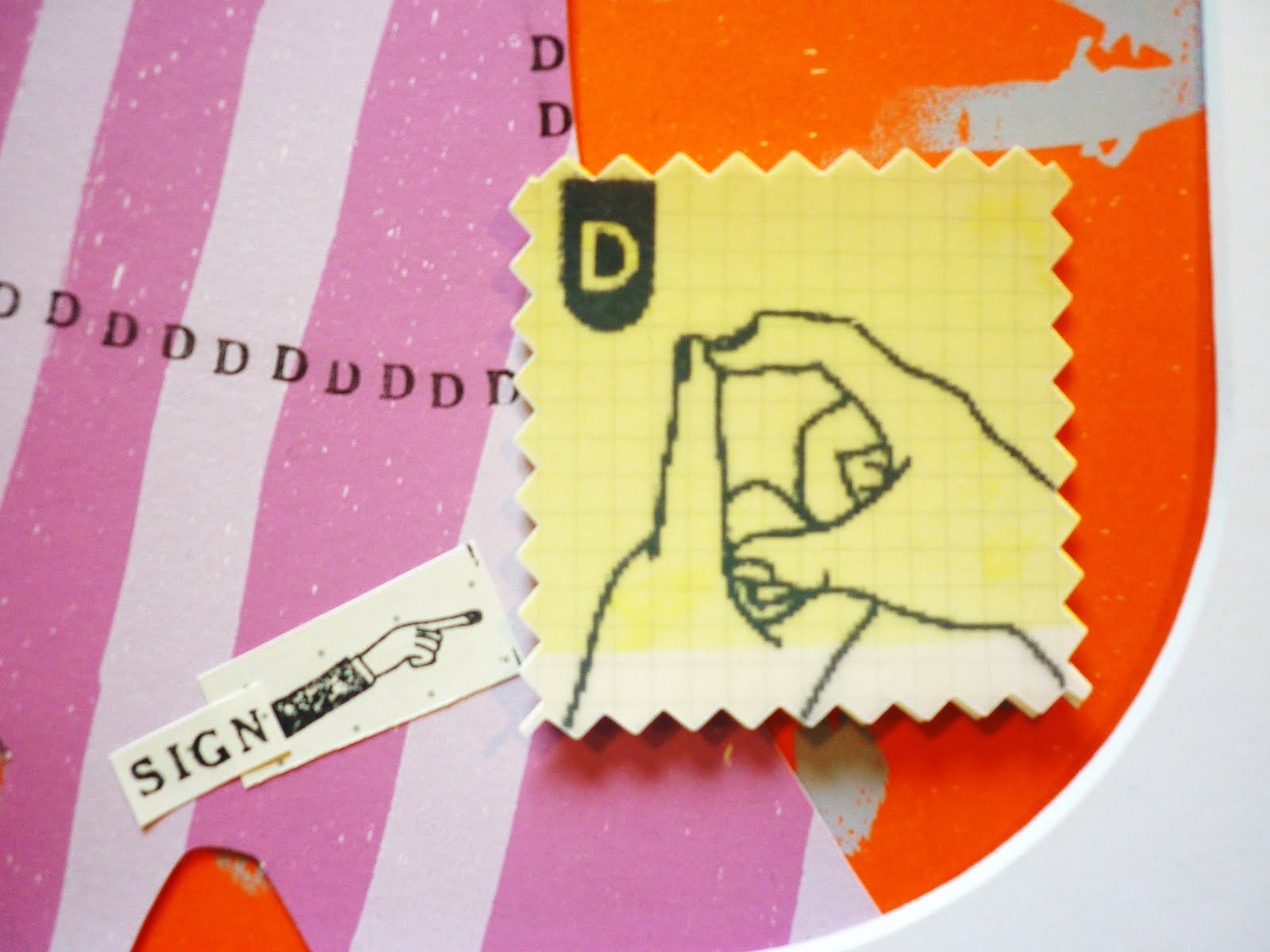
Having worked out the basis of my design, the next stage was to take each letter individually and develop images to enhance that letter, concentrating on a style that would be attractive to children, therefore creating a finished product that had upper and lower case with the sign equivalent.

I've tried to have a quirky image to support each letter, but each image had to start with relevant letter, e.g. Oooodles of Owls. Some of the letters have been relatively simple to create, but I must say some have been extremely difficult such as Q. The Queen would be the obvious choice but I eventually finished with a Quackers Queen duck, hopefully the quirky side has come through.

I have enjoyed the Illustration course here at Solent University so much , It's been an amazing time. I have met some very talented wonderful youngsters that have kept me going! The teaching staff have been incredibly supportive and unerstanding and made me laugh on many occasion. 
Thank you to all of my family, especially to my wonderful son Oscar who not only inspired me to create this use of ABC and sign language but to return to education and believe in myself and my art. Also all of my friends who have supported me throughout this project.

ABC.....Finished


Completed illustrations

So here they are ,my final images of the ABC that I have been working on all this time. Im ready now to choose the 8 that I will frame and put into the exhibition. Rather exciting!
It,s not over for me yet though as I have so much more I want to do before the handing in date. That includes posters of my letters, cards and sketchbook work but thats fun stuff to do anyway.
Im a little disapointed in my photography of the whole piece sorry! I don't think they have come out too brilliantly which excludes some of the detail. I think untill I actually scan them in that will be the case anyway and I did'nt have that kind of time whilst doing this blog but I certainly will at a later date.


Friday 13 May 2011

Z is for Zany feeling....it's all done


Zoooooming Zebras

Z...... is here finally! So strange to think this is my very last of my ABC... final illustrations. This image is cute I think , extremely child friendly and fun.I don,t think it's not one of my favourites but the image works really well.
It's certainly been a journey and working on these pieces has become so part of my everyday life it's going to be strange not having to think about the next letter and new imagery. I've spent over ten weeks building up the process of finally getting to this stage and Im feeling mixed emotions of incredible pride and a little sadness it's almost at an end.

Thursday 12 May 2011

Look at me all business like !....


My printed business card

Yey! went to collect my stash of business cards today and they look terrific Im really pleased with them. I did'nt do a huge amount as I was'nt sure how they would turn out but if im lucky in business I may make more ha ha !
Otherwise these will just collect dust !No only joking will be sending lots of promotional material out at the end of my exhibition.
The image I chose is from my sketchbook and also will be in the catalogue with all my details so I think it all goes together quite nicely....hope you like it too?

Y is for Yo Yeti !....


Y...ello....w Yeti !

Yes I would like to know if Yetis do actually exist and this fella above is My interpretation of how I would like a yeti to look! Really enjoyed making him and I think I will put the finished piece in the exhibition. He's a little different so I think he will go down well?
I like the printed background too as it was a print that went a little wrong but has a lovely finish to it.
WEll im framing at the moment and it's a nightmare arggggg!!! you think it's just about perfect then you find a cat hair smack bang in the middle of the framed piece. You do need a heck of a lot of patience. Im not a framer haha!!


Wednesday 11 May 2011

ABC Sign.....


sign language

I sorted out my sign language for my illustrations. This is my chosen imagery, I drew the image and scanned it in then photocopied it onto graph paper accetate.Ive put it on top of my printed background to soften it and cut it with a jagged edge.Im really pleased with the finished product.
It does'nt look too graphic and blends into the final illustration really well as you will see when I publish my overall finished pieces.


X is for Xtremely exhausted....


Noughts & crosses anyone?

X is for a good old game of noughts and crosses!Trying to get away from the usual ABC images in illustration I felt doing this was a little risky  but Because of the nature of my work I think I can get away with being a little bit cheeky!
Kids will understand where im coming from too ... we underestimate them sometimes. I loved the colours in this one but unfortunately my photographs does'nt do it justice really. I felt the printed background works lovely with my printed collaged xxx's.
It's more of a pattern than an actual game of noughts and crosses but when I do some sketchbook work and now I have time for extra illustrations I will incorporate then. 

W is for Wow! what a Whale!.....


Wink at the Whale

With the letter W I've incorporated wonderful whales as you can see. I think this illustration could be the most childlike of all my illustrations.I think I did feel playful on the day of making it. This one will definately appeal to tiny tots? There is something about a whale that is so incredible to a small person , the sheer size must be so overwhelming, so I felt it important to make the image of the whale come accross as friendly and interesting to want to get to know.
I love his whooly hat that he's wearing too ...it's jolly good fun! Well im nearer to the end of my ABC...How exciting,Three more to go whoop...whoop!!!!


Tuesday 10 May 2011

V .....IP


very important print


V is for VIP....I like this idea as it's a lovely idea that Icame up with whilst sat in a hot bubbly bath! The centre has  mirror paper which means whoever looks at the illustration will become that VIP...voila!
I hav'nt quite finished it yet as down the sides I do want to put my pointy finger and hand but I need to enlarge them and print them off first but I think what I've shown gives the general idea?  Do you like it ? I really wanted to go with the black print but the corner is damaged ....so red it is.
Also all children are little VIP's I think!


U For Under my Umberella....


Union Jack Ideas

Worked on a couple of ideas with the Union Flag for the latter U. Also a way of incorporating an umberella and clouds and rain making the beautiful colours of the flag blaze through.This isnt quite the finished image but im going along these lines.I do like it but I want to change it slightly as you will see at the end when I post my final images.