Inspiration
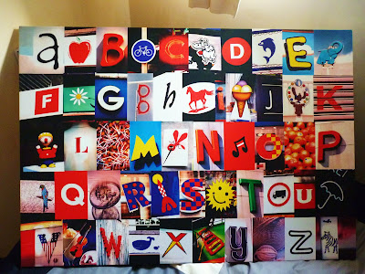
Apple ,Bicycle,cow....Gregoire Ganter 2008
My Interpretation
Hand screen printed Roman Bullion ABC
To conclude my Final Major Project I want to let you know how I came up with the original idea and how I developed it from my own interpretation. The picture at the top of this post is something that I bought for my disabled son Oscar. I loved the colours and the concept of having different designs to emphasis the letters, rather than a boring old A - Z. From there I've decided on the font that I want to use and hand printed a simple set of letters using some screen prints, as a background, that I'd prepared beforehand.
Having worked out the basis of my design, the next stage was to take each letter individually and develop images to enhance that letter, concentrating on a style that would be attractive to children, therefore creating a finished product that had upper and lower case with the sign equivalent.
I've tried to have a quirky image to support each letter, but each image had to start with relevant letter, e.g. Oooodles of Owls. Some of the letters have been relatively simple to create, but I must say some have been extremely difficult such as Q. The Queen would be the obvious choice but I eventually finished with a Quackers Queen duck, hopefully the quirky side has come through.
I have enjoyed the Illustration course here at Solent University so much , It's been an amazing time. I have met some very talented wonderful youngsters that have kept me going! The teaching staff have been incredibly supportive and unerstanding and made me laugh on many occasion.
Thank you to all of my family, especially to my wonderful son Oscar who not only inspired me to create this use of ABC and sign language but to return to education and believe in myself and my art. Also all of my friends who have supported me throughout this project.


No comments:
Post a Comment